 Upgrade
 Member
  Verify Account
  Favorites
  Membership
  View Profile
  Edit Profile
  Photos
  Account Settings
  Alerts
  Support
  Found a bug? Billing Support What's New FAQ Etiquette Privacy Policy Terms & Conditions
 What's New
Message Performance
Time is precious, so we have increased the speed and load times for all messaging.
You will notice that your messages are loading faster and responding quicker, allowing you to control your conversations in a timely manner.
New Message Indicator
We know that your message inbox can fill up quickly, leaving some unread messages lost in the mix.
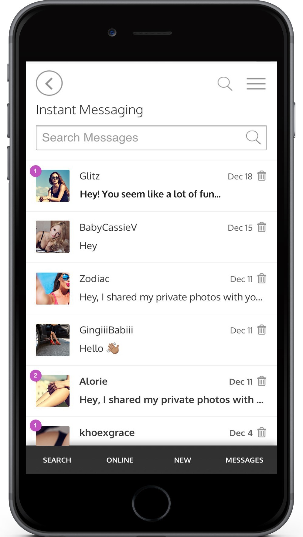
No longer is that an issue as we adding a new message indicator on the thumbnail of the message that you haven't read.
You'll see a purple circle with a number inside, indicating how many new messages from that member you have. Along with the purple circle, the new message text will be bolded.

Message Search
We've added a new feature to your message inbox to make sorting and finding a specific message or conversation much easier.
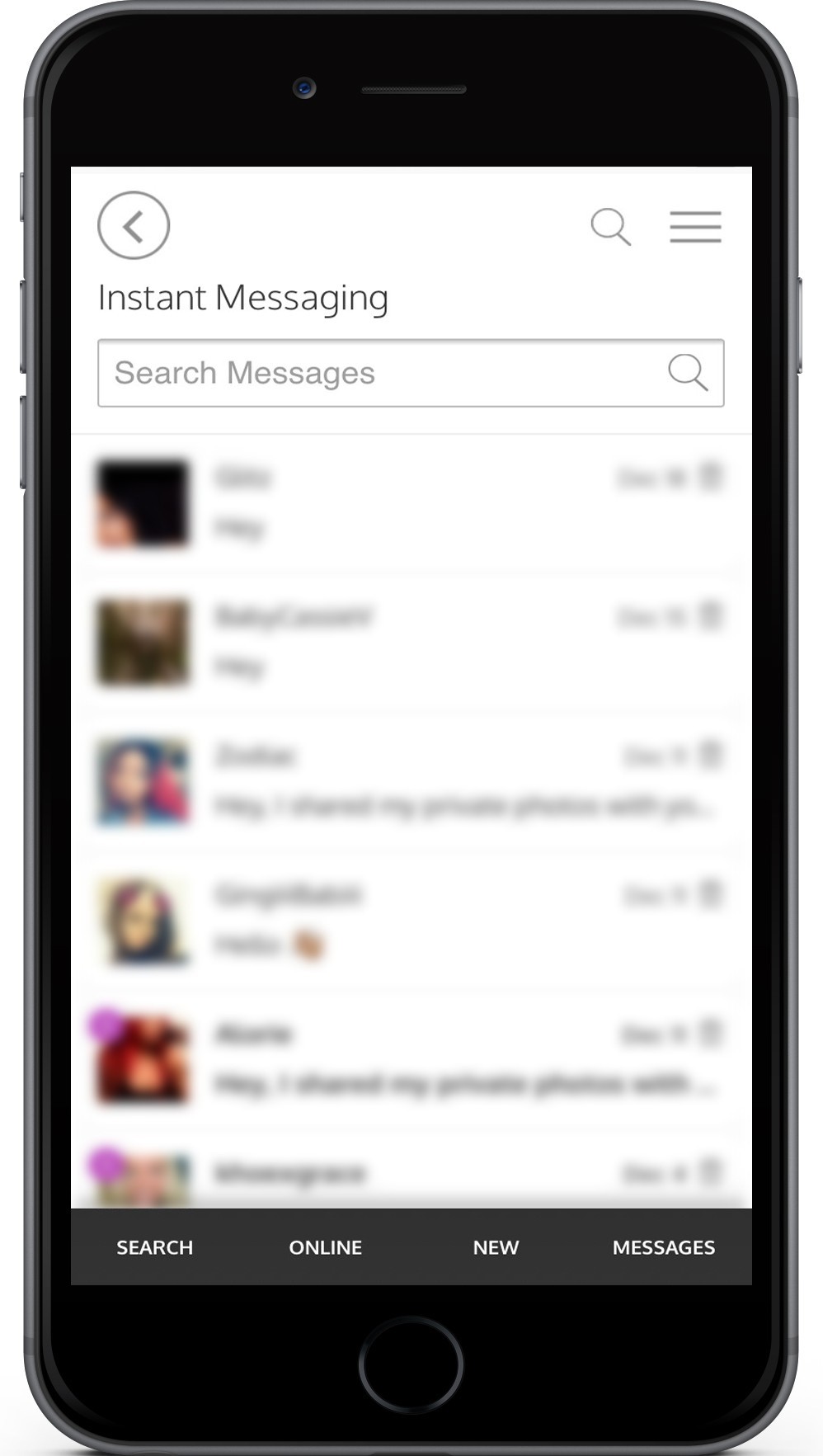
At the top of your message inbox (mobile) or top left of your messages (desktop), you will see a search box.
No longer will you have to scroll and sort through all of your messages to find what you're looking for.
Search for a specific word, phrase, or member name.
Mobile View:

Desktop View:

Video and Voice Calling
We've recently added a new feature to allow for in-app / mobile / desktop video and voice calling.
We know privacy is important to our members and that is why we have added the ability to make a video or voice call from within the app and website. No phone numbers are needed. It is completely discreet and private. Data charges may apply according to your personal data plan.
To make a call, both members will need to be online. This prevents any unwanted calls when you are not using the app.
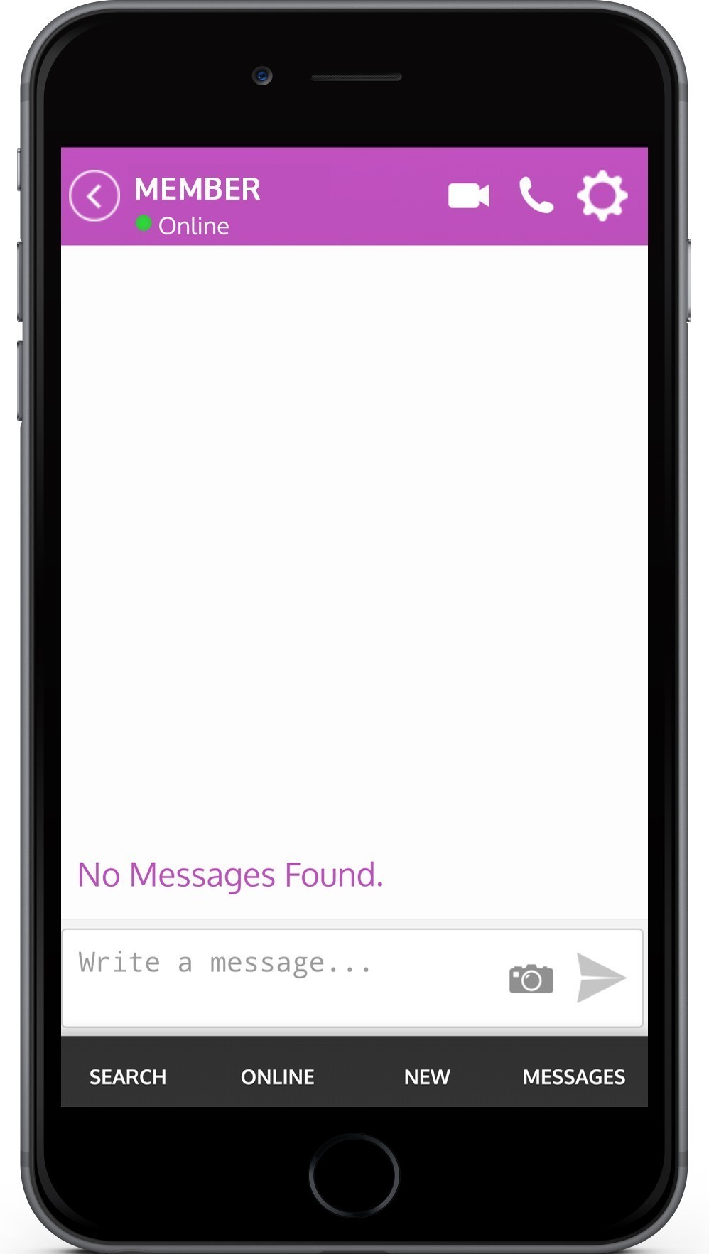
From within your message conversation with a member, you will see a camera and microphone icon located next to the user's name. Click the preferred method of contact and wait for the other member to pick up. The calls are made through our app, so no phone numbers are needed. Data charges may apply according to your personal data plan. It is completely discreet and private. If you do not see the video or microphone icon next to a member's name, this would indicate that their device is not available for this type of communication.

New Design - Faster Performance
We've spruced up the app with a faster, cleaner, and easier to use design to help you make a connection!
Doing away with the clunkyness and clutter, the app is now better streamlined and easy to use.
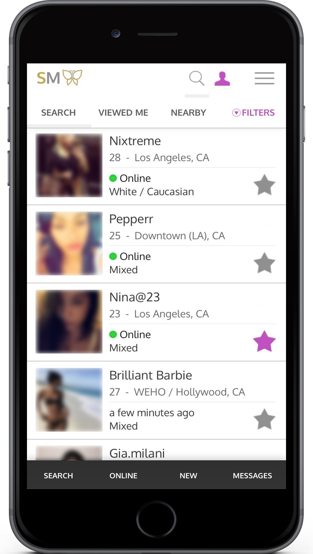
Our search view now has a quick navigation at the top of your list as well as an easy jump bar at the bottom of the screen. The bottom navigation bar will always be there, helping you move around the app with ease. Our top navigation includes our updated filters. No more clunky check boxes and awkward selections. Open the filters, select or slide your results and click search.

Our new profile layout brings a clean look that makes it easy to better see and read about your future connection. We've placed the photos at the top into a slide show. They're activity status and verification status are easily seen just below their photos. The message button has been moved to a sticky at the bottom of the screen. Scroll to view the entire profile, however, the message button will always be there for you when you're ready to reach out to the member.


 Search