 Upgrade
 Member
  Verify Account
  Favorites
  Membership
  View Profile
  Edit Profile
  Photos
  Account Settings
  Alerts
  Support
  Found a bug? Billing Support What's New FAQ Etiquette Privacy Policy Terms & Conditions
 What's New
New Design - Faster Performance
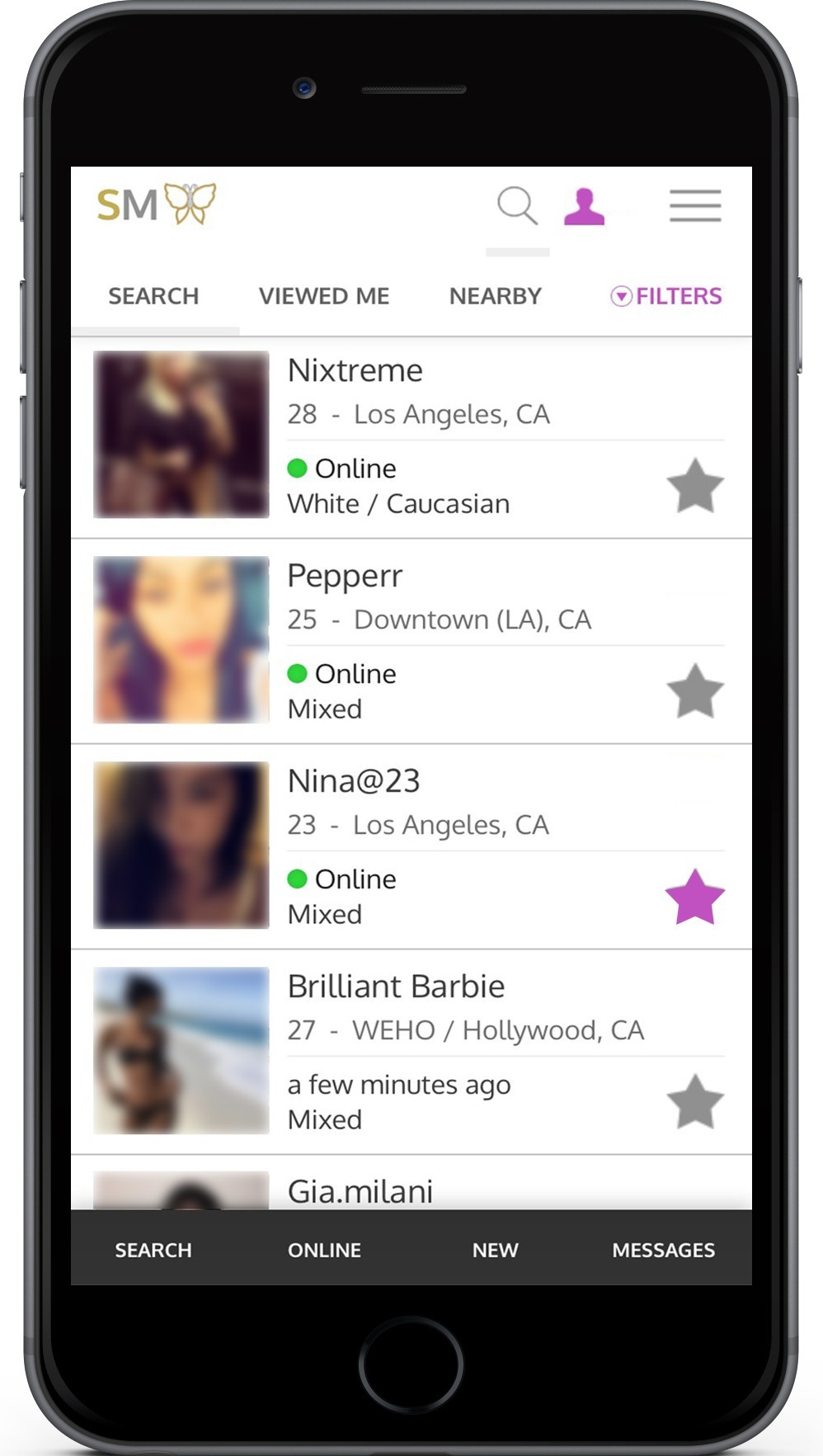
We've spruced up the app with a faster, cleaner, and easier to use design to help you make a connection!
Doing away with the clunkyness and clutter, the app is now better streamlined and easy to use.
Our search view now has a quick navigation at the top of your list as well as an easy jump bar at the bottom of the screen. The bottom navigation bar will always be there, helping you move around the app with ease. Our top navigation includes our updated filters. No more clunky check boxes and awkward selections. Open the filters, select or slide your results and click search.

Our new profile layout brings a clean look that makes it easy to better see and read about your future connection. We've placed the photos at the top into a slide show. They're activity status and verification status are easily seen just below their photos. The message button has been moved to a sticky at the bottom of the screen. Scroll to view the entire profile, however, the message button will always be there for you when you're ready to reach out to the member.


 Search